DATA VISUALIZATION is the presentation of data in graphical format. The primary goal of data visualization is to communicate information clearly and effectively to users of the dashboard or reports as spreadsheets are hard to visualize. Data visualizations help people see trends that were not obvious before. Popular data visualization diagrams are Bar charts, Pie chart, Line chart, Tree Map, Bubble chart, Scatter chart.
HOW TO DECIDE WHICH VISUAL IS THE BEST?
One of the biggest challenges for non technical and business users in producing data visualizations is deciding which visual should be used to represent the data accurately.
- Understand the message to communicate i.e. relationship, comparison, composition or distribution
- Experiment with the available arrangements
- Finalize the best arrangement
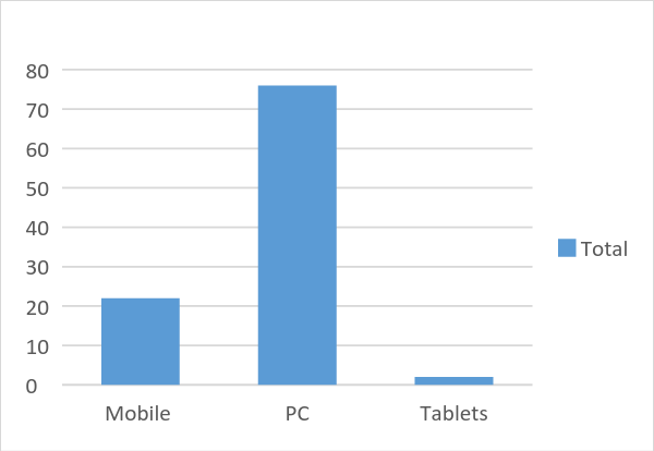
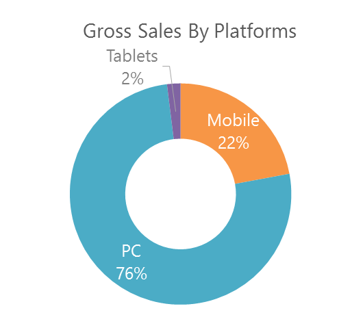
An online retail store generally collects data about its customers and where are they coming from i.e. platforms and websites. I want to depict the sum of gross sales by platforms. Online platforms can be broadly classified into PC, Mobile and Tablets. As depicted below, two types of graphs can be used bar charts and circular charts. My recommendation is to visualize using circular chart as it gives us a clear overview. Also various bar charts depicting gross sales by quarters can be shown.

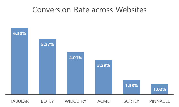
Conversion rate can also be calculated based on the granularity of data i.e. % of Visits that converts to Orders. It is one of the most important metric for our business because the ultimate goal of making a good website, offer amazing products, attracting customers to our website would only work when we will be able to get the customers to purchase from our website, which would in turn generate more revenue and profits for us. Source: Self-Created
FINANCIAL SERVICES – Accounts Receivable Graph
Below is the visual representation of the financial data of an organization. There can be multiple ways to display information about the total amount receivable over a period of time. It shows how much customers owe you over a period of time.
- The information can be represented in a tabular format displaying amount receivables by time by customer where column1 will contain values for amount receivable and column 2 will contain the customer names for a particular month.
- My recommendation is to represent this in the form of pie chart as it will display how much each customer owes and also the relative comparison with other customers can also be easily obtained. It gives a good overview at a high level of the receivable report for the organization.
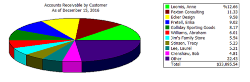
Source: http://fasttracconsulting.com/2011/11/five-quickbooks-accounts-receivable-reports-for-your-business/
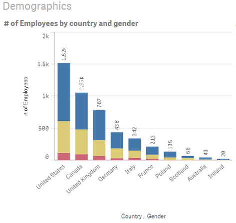
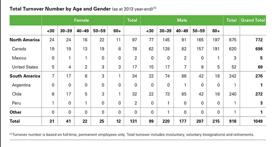
HUMAN RESOURCES DEPARTMENT – COMPANY EMPLOYEE PROFILES
To track the demographics of the employees in an organization numerous visualizations can be shown as shown below in the form of a bar graph or table. My recommendation is to depict using bar graph as it is very simple and easy to comprehend report as compared to the tabular format.
REFERENCES
No comments:
Post a Comment